What’s an inclusive brand, really
What’s an inclusive brand, really
I was reading an article by a medical specialist Sara Nisula the other day (not because I’m in any way medical myself — I can just about…

I was reading an article by a medical specialist, Sara Nisula, the other day (not because I’m in any way medical myself — I can just about take my son’s temperature and with some confidence determine the next action, usually ending up calling my own mother for advice.) No, I was reading her article because about a year ago we finished working on a brand that’s part of the project she’s writing about.
“First thing in the morning I log into the ER’s own system, but because I cannot access the doctors’ notes there, I log into the hospital’s general system. That system then needs other systems to open, so that data about lab results, imaging and control rooms are brought up. I guess I could scream from the window to the adjacent city hospital — since I can’t access their separate information system from here.”
Even though I knew a lot of the background of the change program, it hadn’t quite sunk in how much time and how much effort it actually can take for anyone working in health or social care to use tech systems to get things done.
Systems that are meant to be helping the process and the basic daily tasks.
So, I thought maybe it’d be interesting to re-visit the part where we at Fjord Helsinki helped to re-define the visual identity, the brand values, and their following principles, all the way down to decision making for a Design System.
Background
When a person living in Finland has anything to do with public health or social service, data of that time is stored somewhere. The same happens when they are served by the private sector — data again stored somewhere else. So far, this probably goes for most countries. There’s a reason why medical and social data is protected in complex ways, and there’s no doubt that security around it should remain, or become stronger still.
The problem with most of the current technical systems, however, is, that where data sharing and access is actually possible and needed, the platforms are so clunky that an estimated one-third of a medical professional’s work hours are spent looking for information that really should not be so difficult to reach.
For an individual, that same data, even though their own, has been impossible to access and use within the public sector.
Until now, that is.
Apotti was established in 2015 as the first information system in the world that combines social and healthcare services in one place. It’s a user-friendly tool on its way to transforming the day to day tasks of professionals. The project is covering approximately 1.6 million people in parts of Finland, with an aim to grow across the whole country and later scale internationally.
Signs of change
Apotti team told us their existing brand was no longer supporting their values or personality — their shared principles of openness, collaboration, people-centric approach, and inclusiveness were not really percolating to the brand elements or touchpoint.
The overall identity of Apotti felt limiting instead of empowering at a time when a lot of the public would meet the service for the first time.
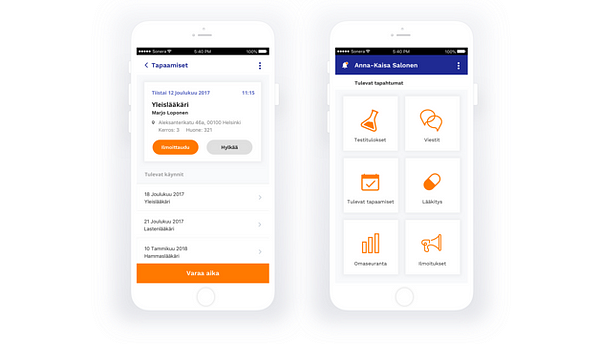
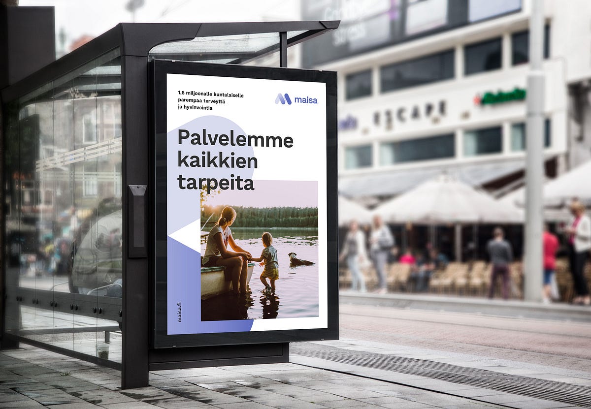
The project itself is enormous and there are many areas of which are progressing simultaneously and at different pace — the part I’ll focus on for now is the re-building of visual systems from the ground up for both Apotti, as well as building a new brand (a citizen facing service instead of professional facing) named Maisa.
Every major brand or organisation usually has a set of values that can be a great tool when it comes to giving employees a sense of purpose and setting a point of differentiation to other brands.
However, they can also be ambiguous or so high level that they can be interpreted in many ways, or not really felt in any way.
The first step was to agree on the reasons the service exists — who it’s for and what the signature moments should be like.
Then we could define how to best deliver the brand experience.
For example, one of the agreed brand values of Apotti is ‘Reliable’.
To describe how reliability can be experienced could go along the lines of Our service will never let the user down. This then can evolve into a guiding design principle; We need to be clear, simple and easy to understand. We need to instil trust by being transparent and even predictable.
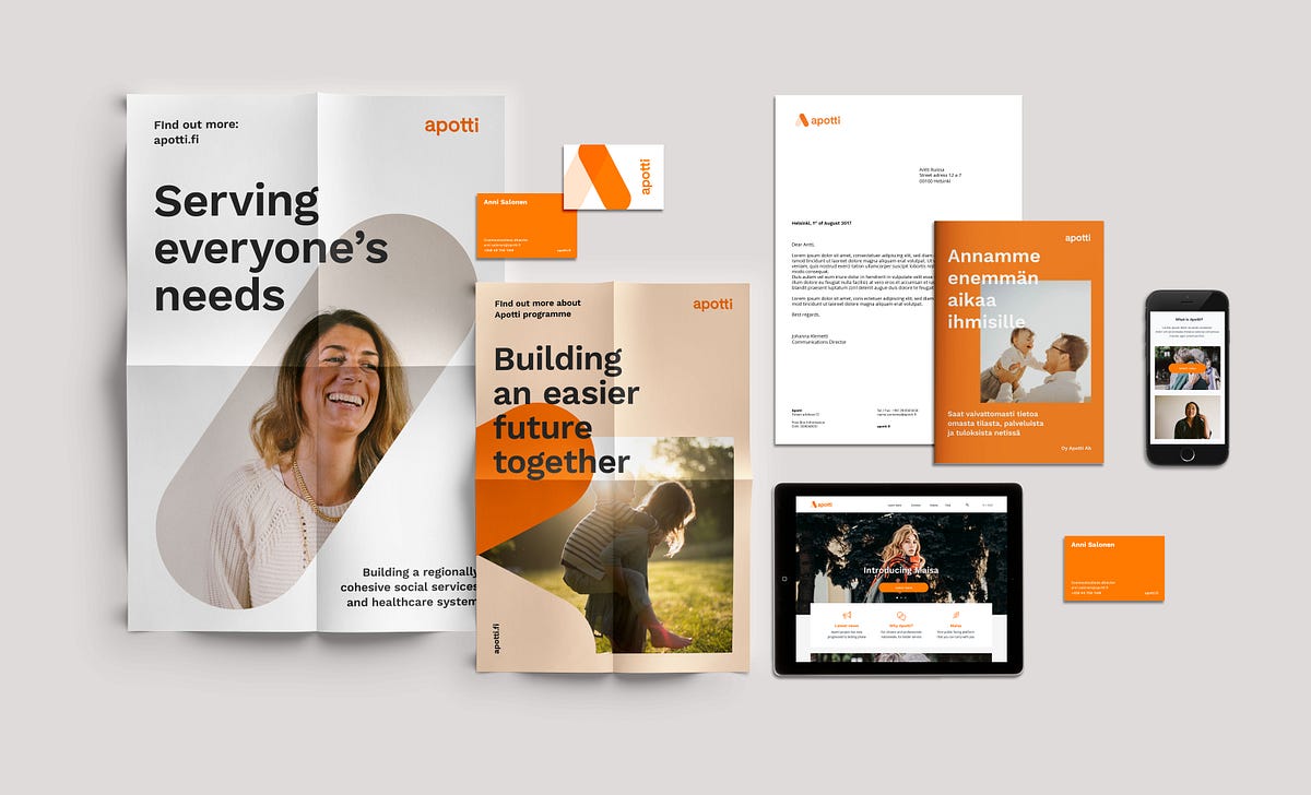
In a few steps, we’ve worked down from high-level brand values to actionable principles that inform the design decisions. With this approach, we got to the building blocks of the new identities and the foundation of a design system.
Change of sign
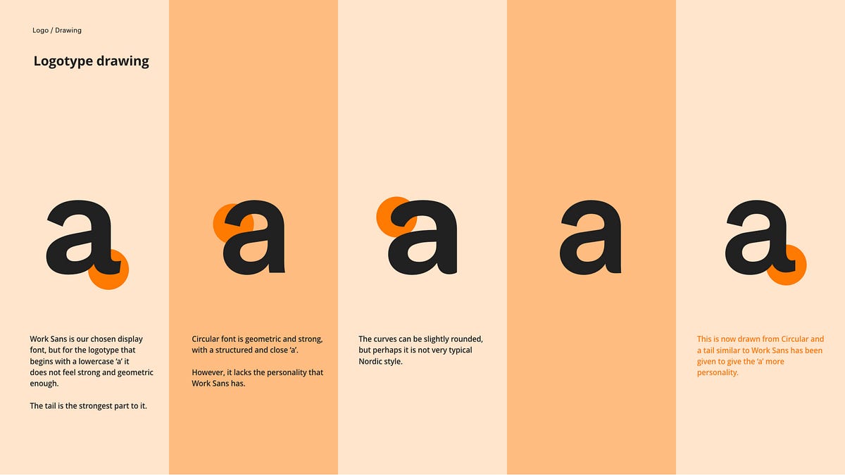
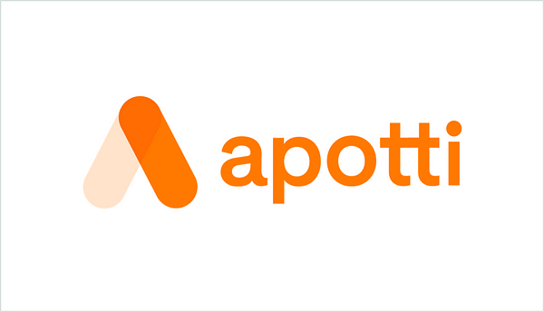
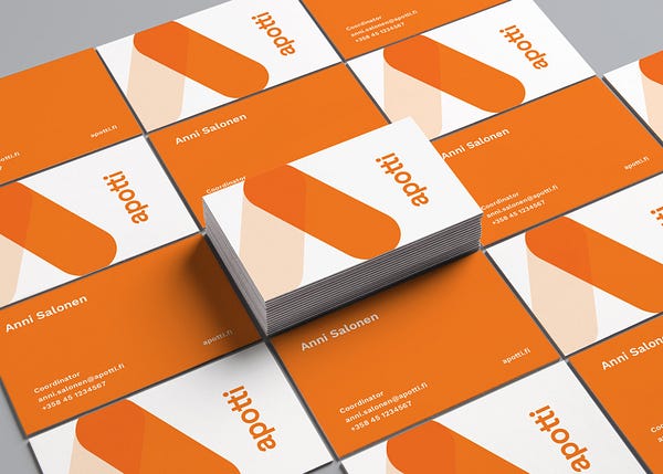
The new Apotti logo was released late last year. The other elements are steadily following through, with improved user interfaces and a library of components being put to place.
I recall a night last December, minus twenty or so degrees outside and I was walking to meet some friends when I spotted this enormous lit logo up on the wall of a building.
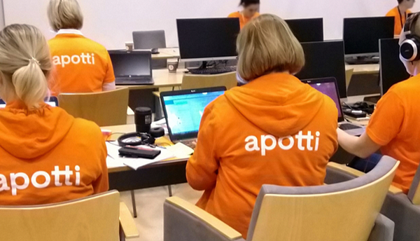
It hadn’t really occurred to me up until that point how little the re-brand had been discussed in media. That may sound a bit dull but the fact the new logo was welcomed without much fuss, and better yet with a full embrace by the employees –printing their new posters and proudly wearing the new tees and jumpers– felt like a job well done. We had succeeded in making the project stronger and more inclusive of the employees’ wishes — and now they could confidently go on and keep doing the amazing work.
I took my phone out and braved the cold with mittens off, trying to snap a photo and capture the sign. I think my screen (literally) froze after a short moment so what I got, in the end, was a bright swoosh of orange, somewhere in the distance. Still, a very proud moment.